
.png&w=3840&q=75)
Why keeping weight under control is so important?
Excess weight affects human life with psychological, physical, social and economic consequences.
What is clearly a valid statement for human beings, it can also adapt – with few limitations – to machines and Databases:
A constant and effective monitoring activity reveals to be a fundamental action, in order to maintain your SAP ERP and BW system “healthy” and well-performing.
Therefore, if you’re considering a migration to S/4HANA or simply to a new ECC powered by SAP HANA Database, it’d be wise measure the pulse rate of your system upfront.
How fast the data volume is growing? At what pace and in which direction (modules, applications…) the growth is happening?
Answers to these questions is becoming a crucial must-have for igniting a prompt action & correction plan.
In my previous blog “SAP System Check-up for busy IT people” I’ve explained how to download and upload the list of SAP Top 1,000 Tables and to run a visual analysis on them.
Now I’m going to illustrate the “magic” to compare two different snapshots taken at different time intervals (i.e. 2 months elapsed time).
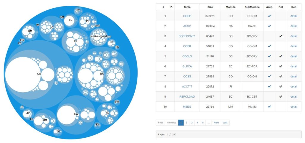
So, let’s start first with the first download and upload of the top 1,000 tables into the WebApp.
We will have to following data visualization:
Let’s assume now that two months have already passed by, and let’s upload a fresh snapshot for the same system.
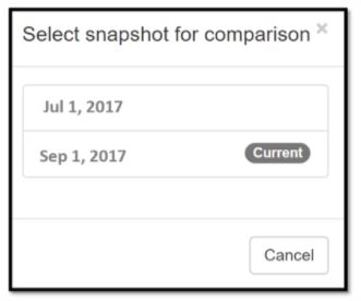
Now we have two snapshots ready for comparison:
- “Old” Snapshot (f.e. taken on Jul 1, 2017)
- “New” Snapshot (f.e. taken on Sep 1, 2017) All we need to do in the WebApp is to click the “Compare” button:

A pop-up window will open, asking to select the snapshots you want to compare:
At selection confirmed, a new graphical representation will appear in a “heatmap” shape:
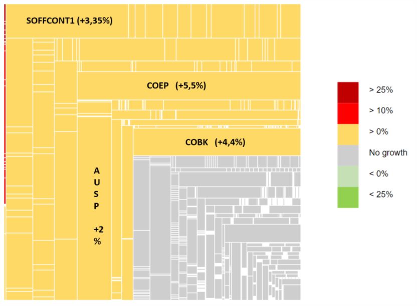
Let’s have a look at what message the Heatmap Chart is try to convey (for this specific analysis):
- GREY AREA: a significant amount of tables did not grow at all (in the 2 months interval of this analysis). It’s strongly recommended to check in detail the biggest unchanged tables. You might even find a no-longer active Behemoth Table which can be easily submitted to Archive or Housekeeping.
- YELLOW AREA: The majority of tables grew between 0 and 10% in the two-months interval.
- RED AREA: the amount tables registering a growth over 10% is limited, and there are no big tables in this area.
- GREEN AREA: Missing here! This simply means that neither Housekeeping nor Archiving activities have occurred in the time interval. This can be an indication that – on this specific system – Housekeeping and Archiving policies are not in place at all.
And now how is your SAP System doing?
Run the analysis for your SAP system and follow this tutorial how to upload the list of the Top 1,000 Tables in the Inquaero Semplice WebApp.
Register and get your free membership at https://app.inquaero.com/register in order to run the App.
You’ll be able to upload independently the list of Top 1000 tables from your SAP system, and to receive an instant analysis about your tables distribution per SAP module, plus archiving and housekeeping potential and many more valuable insights.
We do not collect any sensitive data. Only a list of common SAP Tables with their size. Need assistance in running the analysis? Email us info@inquaero.com
.png&w=3840&q=75)
.png&w=3840&q=75)
.png&w=3840&q=75)